
Mobile-First Design

Mobile-First Design Services That Hold Up

Most of your users arrive on a mid-range Android, holding it one-handed, on a connection that drops. We design for that phone and that network first and let the layout grow upwards, which is why the desktop version turns out to be the easy part.

Trusted by teams worldwide

Connexate Meshmedia Oaky Setia Haruman Wave Sugar

From Research on the Device to a Screen That Works at 360px

Six lines of work, in the order they actually happen. Research decides the structure, the structure decides the layout, and nothing gets wider until the narrow version holds.

01

UX Research

  • Interviews run on the handset people actually own
  • Session recordings from real devices, not a simulator
  • Task analysis against a one-handed grip
  • Competitor teardowns read at 360px, not at 1440
  • Findings written as design constraints, not a deck
Explore Research
02

Structure & Flows

  • Information architecture before a single screen
  • One primary action per screen, and it is obvious
  • Navigation that still works at five items, not fifteen
  • Progressive disclosure instead of a wall of fields
  • Flows drawn for interruption, not for a perfect run
Explore Structure
03

Mobile-First UI

  • Every screen designed at 360px before anything wider
  • Controls inside the thumb arc, destructive ones outside it
  • Type and spacing that survive 200% zoom
  • Dark mode from the same tokens, not a second file
  • Every state drawn: empty, loading, offline, error
Explore Mobile UI
04

Responsive Systems

  • Breakpoints set by the content, not by device names
  • Fluid type and spacing, so there is no dead zone
  • Layouts that reflow rather than rearrange
  • Tables and dense data that survive a narrow screen
  • Desktop treated as the enhancement it actually is
Explore Responsive
05

Design System & Handoff

  • Tokens for colour, type, spacing, radius and motion
  • Components documented with every state they can hold
  • Accessibility notes attached to each component
  • A performance budget written into the spec
  • A handoff an engineer can build from without asking
Explore Design Systems
06

Usability Testing

  • Moderated sessions on real handsets, not a desktop browser
  • Unmoderated tasks at scale when the question is simple
  • Tested on a throttled connection, because yours will be
  • Screen-reader passes on the flows that matter most
  • A retest after the fix, so the improvement is proven
Explore Testing
Deep Capabilities

Designed for the Phone Your Users Actually Hold

Six things that decide whether a screen works on a phone, and the tools we reach for in each.

Thumb-Zone Layout

Thumb-Zone Layout

The comfortable arc on a six-inch phone held one-handed is smaller than most layouts assume. Primary actions sit inside it, and anything destructive deliberately does not.

Reach mapOne handTargetsBottom nav
Performance Budget

Performance Budget

Largest Contentful Paint, layout shift and input delay are design decisions long before they are engineering ones. We agree the numbers first, then design inside them.

LCPCLSINPImage budget
Offline and Failure States

Offline & Failure States

Trains, lifts and basements. Every flow gets an offline state, a retry and a message a real person can act on, drawn alongside the happy path rather than after it.

OfflineRetryError copyEmpty states
Accessibility on a Small Screen

Accessibility on a Small Screen

Contrast that survives direct sunlight, targets large enough for an imprecise tap, and a screen-reader order that matches what the eye follows. Tested rather than assumed.
WCAG 2.2ContrastFocus orderScreen reader
Input, Keyboards and Gestures

Input, Keyboards & Gestures

The right keyboard for the field, autofill that fills, and gestures that do not fight the operating system's own. Small details, and the first ones to irritate.
AutofillInput typesGesturesHaptics
Responsive Beyond the Phone

Responsive Beyond the Phone

The same tokens carry a layout from 360px up to a desktop dashboard, so one system covers the whole range instead of two designs quietly drifting apart.

Fluid typeBreakpointsTokensContainers
Free Mobile UX Audit

Does It Hold Up on a Phone? Find Out Free.

We take your product on a mid-range handset over a throttled connection, and send back what we hit: where the layout breaks, which taps miss, what the first screen costs to load, and the three fixes worth doing first.

Get Your Free Audit

Free · No obligation · Back to you in two working days

Planning your project with Appther
Our Process

How a Mobile-First Project Actually Runs

Five phases, each ending in something you can open on your own phone and judge for yourself.

1
Week 1

Research on the device

Interviews, session recordings and a heuristic pass, all done on the handsets your users actually carry rather than on a desktop browser at full width.

2
Week 1–2

Structure before pixels

Information architecture, the one primary action per screen, and low-fidelity flows that assume the user is interrupted halfway through.

3
Week 2–5

Designed at 360px first

The narrow layout is drawn, reviewed and signed off before anything wider exists. Every state is drawn with it: empty, loading, offline and error.

4
Week 4–6

Tested on real handsets

A clickable prototype put in front of real users on real phones, on a throttled connection, with a screen-reader pass on the flows that carry the most traffic.

5
Ongoing

System, handoff and budget

Tokens, documented components, accessibility notes and a written performance budget, handed over in a form your engineers can build from without a meeting.

Measurable Impact

The Numbers We Design Against

360px

Where every layout starts

Every screen is drawn at the narrowest width we support before a wider one exists.

2.5s

The LCP we budget for

Largest Contentful Paint on a mid-range phone over 4G, agreed before design starts and measured after launch.

24px

Smallest touch target

Below this, taps start missing. Anything destructive sits outside the thumb arc entirely.

200+

Products shipped

Apps and web products designed and launched since 2018, across six industries.

Tech Stack

The Tools Behind the Small Screen

Figma FigmaFramer FramerSketch SketchStorybook StorybookLighthouse LighthouseChrome DevTools Chrome DevToolsSafari SafariAndroid AndroidMaze MazeHotjar HotjarGoogle Fonts Google FontsMiro MiroNotion NotionLoom Loom
Industries

Built for Your Vertical

Six sectors where the phone is the primary screen, not the smaller copy of a desktop one.

Healthcare solutions
01

Healthcare & Fitness

Patients booking one-handed in a waiting room, and clinicians on a shared tablet between rooms.

  • Booking in under four taps
  • Results readable at arm's length
  • Consent flows that fit one screen
Fintech solutions
02

Fintech & Banking

Money moves on a phone, so the confirmation screen matters more than the dashboard behind it.

  • KYC that survives a dropped connection
  • Biometric sign-in, with a real fallback
  • Amounts and states you cannot misread
Retail and eCommerce solutions
03

Retail & eCommerce

Most of the traffic is mobile and most of the drop-off is in checkout, so that is where the design work goes.

  • Checkout that fits the thumb arc
  • Images inside the page budget
  • Filters usable at 360px
On-demand and logistics solutions
04

On-Demand & Logistics

Drivers use one hand, in daylight, often with no signal, and they will not tolerate a spinner.

  • Offline-first driver screens
  • Targets big enough for gloves
  • Status legible in sunlight
EdTech solutions
05

EdTech & Learning

Students study on a phone between other things, so sessions have to survive being interrupted.

  • Lessons that resume where they stopped
  • Video that adapts to the connection
  • Progress visible on one screen
Real estate and PropTech solutions
06

Real Estate & PropTech

Buyers browse on a phone and enquire from the listing, so the map and the form carry the whole product.

  • Map search usable with a thumb
  • Tours that load on mobile data
  • Enquiry forms of four fields
Client Voices

Trusted By Teams Who Ship

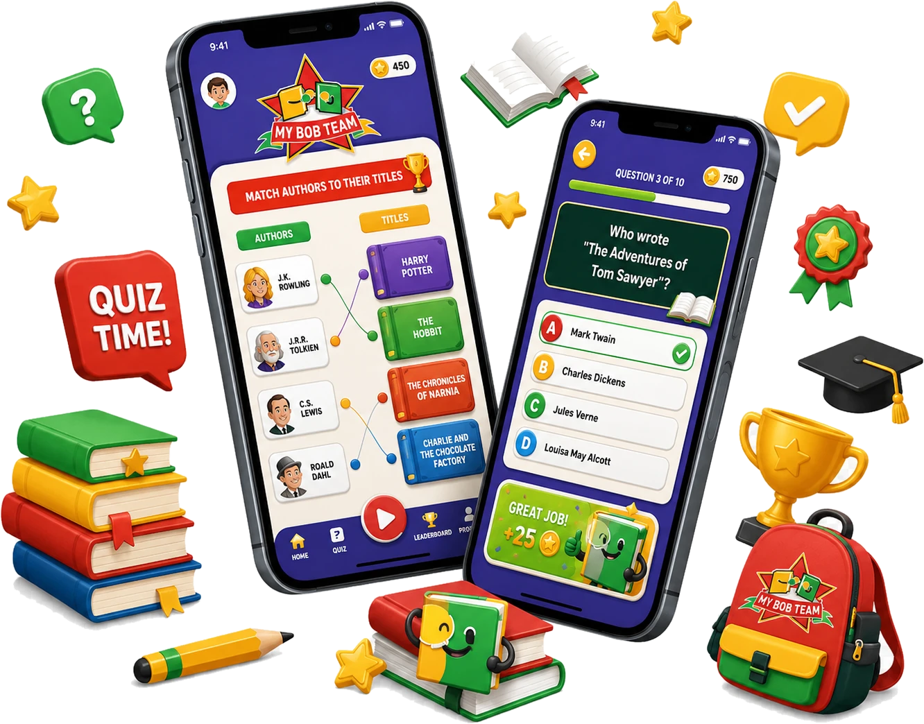
“Appther built our student competition app exactly the way we envisioned it: easy registration, smooth judging, and real-time results that keep participants engaged.”
Dionna Milem
Dionna MilemOwner · My BOB Team LLC
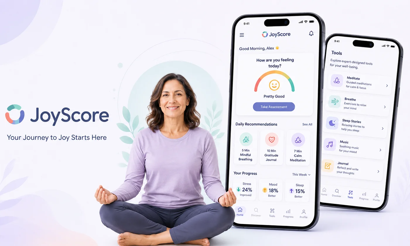
“Building a mental health app means every detail has to be handled with care, and Appther got that from day one. The product feels warm, simple, and genuinely helpful.”

Bob Singhal
Bob SinghalProfessor of Joy · Joyscore Inc
“Appther exceeded every expectation, on time and on budget, and the final product has been instrumental in scaling our business. A rare engineering partner.”
Johnathan Peffer
Johnathan PefferCEO · Bull's Eye Technologies Inc
“Implementing an ERP across our operations felt daunting at first, but Appther made the transition seamless. Every department now works off a single source of truth.”

Pushpender Kumar
Pushpender KumarGeneral Manager · AB Sugar Ltd
Latest Insights

Notes on Designing for Small Screens

Field notes from real builds. No hype, just what worked and what didn't.

All Articles
Free 30-Minute Mobile UX Call

Open Your Product on a Phone. Let's Talk About What You See. Yours Starts Here.

One call gets you an honest read on how your product behaves on a mid-range handset, the three fixes worth doing first, a budget range and a timeline. No deck, no obligation.

Fix shortlist Budget range Delivery timeline
Book My Free Call
200+Projects delivered
4.8★Client rating
15+Countries served
99.9%Production uptime

Keep exploring

Related services

6 links
FAQ

Questions We Hear Before a Redesign

It moves with the number of flows, not the number of screens. A focused redesign of one journey, with research and testing, is a smaller piece of work than a full product with a design system behind it. We quote a fixed price after a free scoping call rather than billing by the day.
No, and the difference shows up in the result. Responsive design usually means a desktop layout that has been made to squeeze. Mobile-first means the narrow layout is the one that gets designed, argued over and signed off first, so the small screen gets the real thinking rather than the leftovers.
Yes, and it is most of what we do. We audit the live product on real handsets, find where people stall or leave, and redesign those flows with the research to back each change. You get the reasoning, not just new screens.
Yes. Tokens for colour, type, spacing, radius and motion, components documented with every state they can hold, and accessibility notes attached to each one. It is built so your team can add the next feature without asking us how.
By treating speed as a design decision rather than an engineering clean-up. We agree a Largest Contentful Paint target and an image budget before the first screen is drawn, then design inside them. A layout that needs six web fonts and a hero video is a design problem, and it gets solved at the design stage.
Always, and on a phone it matters more, not less. We design to WCAG 2.2 AA: contrast that survives direct sunlight, touch targets big enough for an imprecise tap, a focus order that matches what the eye follows, and a screen-reader pass on the flows that carry the most traffic.
An Engineer Replies Within One Business Day

Let's Design It Phone-First

Tell us what you are building, or which screen is losing people. No sales pitch, just a straight answer on scope, timeline and cost.

Free 30-min strategy callScoping and honest, practical advice.
Fixed-price quoteDetailed scope and price after discovery, no surprises.
NDA on requestYour idea and code always stay yours.
Prefer to talk now?+91 99114 32288 · info@appther.com

Book Your Free Strategy Call

Fields marked * are required. We reply within one business day.

🔒 Your details are never shared. NDA available on request.